wright less mies

So I took the Cheney house plan and put it on Mies’ module, replaced the central hearth with a modified Farnsworth core just to see what happened. Iterations ensued, and even Schinkel reared his head.


So I took the Cheney house plan and put it on Mies’ module, replaced the central hearth with a modified Farnsworth core just to see what happened. Iterations ensued, and even Schinkel reared his head.

Keeping the Chicago theme, but moving a bit back in time, today I’ll feature some early Frank Lloyd Wright, particularly the Cheney House in nearby Oak Park. The plan is fascinating because it is an effectively square structure under a large hip roof, divided into two halves: the front is made up of three public rooms (nine square), while the back is broken into four bedrooms (four square), with servant spaces filling out the middle. The hearth is at the very center of the house, typical Wright. This basic parti (formal planimetric diagram) still fascinates me to this day – a simple form with a complex, yet brutally clear interior logic. The variations it inspired will follow over the coming days.


After a short weekend break, I’m back with a few loose ends of Mies that I stumbled on in my sketchbooks. Another take at Seagram (above) and Farnsworth (below), as well as an overlay of Schinkel’s Bauakademie (1836) and Mies’ Neue Nationalgalerie (1968) both square, modular, structures in Berlin.


It’s been a long week of Mies, Mies, and yet more Mies. So here’s a bit of a respite from the daunting Modernism his work exemplifies: Karl Friedrich Schinkel. And yet, there’s something afoot – a link between Mies and Schinkel, which I am definitely not the first to make (see Kenneth Frampton and Thomas Beeby). But whatever the reason, take a little solace in the capitals, pilasters, and peristyles – if only for the now.

In contrast to yesterday’s post, I’m featuring Mies’ earliest work in the United States (and his first experimentation with the ‘revealed’ corner, where the exterior envelope is set off of the structural grid), classrooms at IIT, for which Mies also completed the masterplan. Here, the frame is still made up of wide flange steel sections, but with buff brick infill panels. The window systems are still solid steel bars welded together – the thermal break found in the aluminum and bronze curtainwall systems was still a long way off.


Today, I’m featuring the pinnacle of Mies’ urban tower typologies: the Seagram Building of 1958. The wide flange steel mullions on the Lake Shore Drive apartments are rendered in custom bronze extrusions, with thermal breaks at the windows, but all appearing as though they were constructed of arc-welded steel sections (as at the Farnsworth House). The glass curtainwall is brought proud of the structural column line, allowing the windows to be consistently sized throughout. A contemporaneous example in Toronto follows:


Continuing yesterday’s post, here are yet more of my year-plus studies of Mies van der Rohe’s mature works in details, plans, axonometric, etc.


While working in Chicago, I became painfully aware of how little I actually understood the mature work of Mies van der Rohe, especially with regard to his command of modules, structural regularity, and the finesse of his details. So I drew. I drew every one of his corners I could get my hands on – from the early simplicity of the Lake Shore Drive Apartments to the apex of complexity at the Seagram Building only some 10 years later. Over the next few days I’ll be overwhelming you with these drawings. Enjoy.


I’ve been fascinated with the impluvium for some time now – a large roughly cubic room with an inverted roof that is open to the sky at the center, an essential feature of the Roman domus house typology. This project places a large impluvium at its center, with modern courtyards and bedrooms flaking it, and more traditionally-scaled living spaces at the entry. Formal echoes of Irving Gill, H. H. Richardson, Richard Neutra, and Michael Graves abound.


 Two outer walls are traditionally detailed, while the porticos between them take on an abstract formalist language. The cubic volume of the villa proper is more Mies-ian, and is topped with large shingled hip roof (with the dormer I featured yesterday), while a round stair tower sits on the other side of the far wall (alla John Hejduk’s ‘Wall House’ series).


In a final touch upon the last few posts here (this one, this one, and these two), I just up and slapped Richardson and Nervi on top of one another, aligning the square towers of each project, and highlighting the enormous piers (inner squares are from Trinity, the other ones are St. Mary).

Between reading a biography on H. H. Richardson and glancing through one of Michael Graves’ volumes, I thought up this little dormer – taken from the cantilevered round dormers found throughout Richardson’s work (and the Shingle Style at large), and met it with a perfect circular window (divided into nine lites, of course) such as Graves was wont to use, and made into a lantern of sorts, having windows on two sides. My documentation of Graves’ examples follows.


Where the previous project offered more of a synthesis between the modern and the classical in terms of style, this one poses a synthesis between types – structuring a basilica form with equal transepts, similar to a Greek cross.
This hybrid typology is not new, and can be found in early Christian churches, such as San Nazaro in Brolo or the Basilica di San Marco in Venice. Stylistically, my interpretation takes cues from H. H. Richardson, with thick masonry walls, continuous cornice lines, and a large hip roof, which obscures the tower over the crossing from the outside. Below are earlier studies of a similar plan with much different attitudes towards envelope.


Looking through my sketchbooks, I stumbled across further drawings for the project I featured yesterday. These are studies of the tower, the interior pendentives (the triangular surfaces that mediate between the arches and the tower corners), and the apses themselves.


Taking cues from both the Nervi and Richardson projects, this church places a large tower campanile at the crossing. The circular geometries owe more to Trinity, but the glass corners and spatial fluidity are direct quotes of St. Mary. The tower transitions from a square at its base to a circle at the crown, paying homage to Nervi’s typical hyperbolic paraboloid surfaces.


Following Friday’s post on the High Modernist St. Mary of the Assumption, I present you with another Greek cross church plan, H. H. Richardson’s Trinity Church in Boston. A large tower sits on on four enormous piers at the cubic volume of the crossing, which commands the entire sanctuary, where the apse, transept, and nave ‘arms’ are rather shallow.
 This past February, my wife and I took a weekend trip to San Francisco, where we stumbled across the city’s cathedral – St Mary of the Assumption, by Pierluigi Nervi and Pietro Belluschi. The church is a square, with large piers in the corners supporting a gargantuan lantern, which also doubles as the church’s campanile. The large piers dominate the four corners which have been rendered in finely detailed glass storefronts, effectively making the church more of a standard Greek cross rather than the centrally-focused square it purports to be. I’ll be featuring my own riffs on this project over the coming days, but for now, I’ll let you appreciate the brutal simplicity of the form that started it all.

Though taking its detailing from Greek antiquity, with a Doric portico in antis, this small structure is thoroughly modern in its four-square plan. One enters off-center, in fact, the center is occupied by a column, and the front portico is only made of two columns, with one corner being a bearing wall (this wall is the in antis part). An exedra flanks the main skylit volume. Two variations follow.


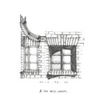
Two small moments from Stern’s monograph c. 1985 that I’ll share: A sumptuous ogee-like hallway ceiling profile paired with a simple arched opening and round window at the Mexx Clothing headquarters, Amsterdam; and a rather straightforward Shingle Style house with wonderfully subtle asymmetries in the Hamptons. That is all.

As per the request of one commentor, I spent some time this weekend fleshing out the project featured in last week’s post ‘courtyards, nine squares, and robert a. m. stern‘. Plan with elevations, enlarged plans and axon above; perspective, details, and roof plan below.


One of the joys of home ownership is also one of it’s banes: renovations. I’m painfully aware of the many alterations or changes I would make to our home, and rather than let these become points of consternation or despair, I’d rather use them as moments of critical thought. So I draw. This kitchen is a thought of what I might like to do to our little Spanish cottage if given the wherewithal. Formally, it takes its cues from the European orangerie tradition – somewhere between a living room and a greenhouse, and marries that typology with some Irving Gill-like elements.


We all know what gas stations look like here in America – banal. Yet, the same ‘Mid-Century’ Modernism that is so popular right now also tidied up these rather pedestrian buildings as well. Mies van der Rohe even tried his hand at one in Montreal as part of a larger development. However, decades of neglect and changing cultural tastes have obscured the once minimal elegance of these structures. I drove past an example in Santa Monica that had been covered up in all the various and cheap appliques of ‘Mediterranean’ style. If Modernism could love this typology, could good Classicism? Behold, the fruits of such thinking – Doric porticos and pyramidal skylights.

I was digging through my sketchbooks and found a nice little partial wormseye axonometric drawing that should have been a part of an earlier post. This one may be a bit more difficult to understand, seeing as it’s a pretty unusual type of drawing. But effectively, what I’ve done is drawn a corner of the project looking from underneath the building, as if the ground wasn’t there.

Another Robert A. M. Stern inspired creation- this one more of a direct interpretation of the larger country estates built during the last decades of the 19th Century, collectively referred to as the Shingle Style. Bob Stern has been one of the forerunners in reviving and interpreting the style since the late 70’s. This is a more stylistically ‘correct’ adaptation, with funkier variations to follow.

The other day, my wife and I stumbled upon a small park in West Hollywood dedicated to Irving Gill’s Dodge House, which was irreverently demolished in the 70’s despite local outrage. So naturally, I binged out on some of Gill’s better works. Here’s the first of a few posts- a small spec house for a San Diego developer, c. 1909, along with a detail of the overhang at the front entrance.

.GIF)
Recent Comments