by nscoleman | Sep 16, 2016 | precedent

Driving through El Segundo the other week, I ran across a nice Miesian office block. A quick internet search for the name ‘Xerox’ which was left stained on a concrete wall and I stumbled across an all too familiar name – Craig Ellwood (Originally built for Scientific Data Systems, which was later bought out by Xerox). A floor plan confirmed my suspicions – a perfect square on 64 columns, raised one floor off the ground with a directional access given by two long walls on the east and west facades, and storefront gazing on the north and south, all centered on a cubic central atrium. The details are almost perfect derivatives of Mies’, but the vertical window mullions stop at the spandrel panels rather than continue full height as MVDR would have done (see Murphy’s Daley Center compared with Mies’ IBM tower). The whole project is undergoing a less than inspiring renovation by SOM, with absolutely no heed for the building module and planted ‘green’ walls. Too bad.


by nscoleman | Sep 14, 2016 | details, entire buildings

Because even the most mundane of elements deserve to be thoughtfully and appropriately considered, I’m featuring a series of details and design considerations for a gate at my house, fronting a small garden courtyard. Typical wood rails span brick piers, with a weighted chain closer to keep things tidy.
by nscoleman | Sep 13, 2016 | details, entire buildings

Returning to the work of Lutyens, this small room takes its primary cue from a detail in a stair hall at Viceroy’s House, New Delhi, where an arcade is topped with a small pendentive at the corner, curving the profile of the ceiling. Wormseye axonometric views follow – the bottom image also has sectional and wormseye studies of another Lutyens-inspired previous post.


by nscoleman | Sep 9, 2016 | details

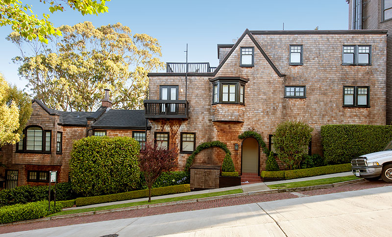
Sometimes the drawings I post seem rather schematic, but as part of the great importance of building in architecture, they can never remain that way. Here I present you with a more detailed take of a recent post, with hybrid Tuscan-Doric columns (perhaps Graves doing Doric, maybe?), minimal Mies-ian window jambs and stops, shingled wall with a moulded cap to make the column in antis, all topped with a simplified architrave, rosettes replacing triglyphs. I fancy the wood work might all be painted a glossy black, similar to Earnest Coxhead’s shingled houses in San Francisco (and Bob Stern’s take on them).
by nscoleman | Sep 8, 2016 | entire buildings

Plan as generator (aka, ‘floor plan comes first, elevations second’), with a long hallway bisecting a semi-cubic volume, colonnades at either end. Now a staircase – centered on the hallway, one half of the house takes a large ballroom, while the other is bisected into two smaller drawing rooms. The second floor, two long, windowed rooms sit over the porches, while a tall pyramidal skylight tops the stair hall.

by nscoleman | Sep 7, 2016 | entire buildings

A study in pure form, this project is a derivative of a previous post, with a curved pediment sits coplanar with the colonnade-cum-pergola that surrounds a circular pool, and some admittedly quirky curved glass-block walls mediating between the three bays of the facade with the smaller volume behind.
by nscoleman | Sep 6, 2016 | entire buildings

Today’s installment is something a little idiosyncratic – this one didn’t begin with a square, but rather a triangle. From that, came a rotunda, and two arms, one of which I furnished with a square. This project takes more precedence from the picturesque traditions, but is still rather rigorous in module and geometry. References stem from Robert A M Stern to Samuel Vosper’s work with the Army Corps of Engineers and a touch of Lutyens.

by nscoleman | Sep 1, 2016 | entire buildings

Today’s piece stems from an industrial building I passed by at Los Angeles’ wastewater treatment plant. The original was a blue corrugated steel box on diagonally braced stilts, with triangular recesses and frames above second story doors. I have no idea what this is used for. None. But The deliberateness of the design was evident, as the entire plant had been drawn up by Anthony Lumsden, a techno-postmodernist. So I clad it in shingles, inspired by some triangular dormers by Ike Kligerman Barkley, and set it on a chunky Tuscan colonnade (a la Graves), and called it ‘house’.


by nscoleman | Aug 31, 2016 | entire buildings

Combining the first and second interpretations of this theme, here’s a take with both the flanking skylights (a la Soane) and the semi-circular colonnade, with two large columns on center to flesh things out.


by nscoleman | Aug 30, 2016 | details, entire buildings

In typical fashion, a synthetic plan was due: taking the vault from yesterday’s post (my take on Lutyen’s take on Soane’s take on antiquity), I slapped a half-round colonnades on either end covered each in a large conical shingled roof. The fun part is the cornice of the cubic vaulted form, which does some funky things to accommodate modules, structure, and walls, shown in the bottom drawing (wormseye axonometric detail). The lantern is a direct quote of the lighthouse lantern at Old Point Loma in San Diego.


by nscoleman | Aug 29, 2016 | entire buildings

I got a new book on Sir Edwin Lutyens, so obviously I’ve been obsessing over his details, here presenting a take on his epic kitchen at Castle Drogo (itself a quote of Sir John Soane’s soaring occuli at the Bank of England). Lutyens is truly fascinating, especially in his seemingly infinite possibility to breathe a sense of whimsy into the often staid classical Orders. My representation is axial, with two rounded skylit bays on either end of the main axis, an asymmetry that reads in the roof eaves as well as the elevations. The main door is marked with a Mannerist curved pediment, hinting at the curved vaults hidden within. The section below cuts through both axes.


by nscoleman | Aug 25, 2016 | entire buildings

This is a collection of market types, with four ancient Greek stoae on the ground level, double stairs up to the second floor market halls, skylit, and further to the commodities trading levels within the tower. An atrium spans between the four levels. An enlarged plan of the entry lobby finishes the drawing set.


by nscoleman | Aug 24, 2016 | details, precedent

I had wanted to draw this while we were on site, but the monk who was giving us a tour was moving at a brisk rate. This is the entrance pavilion to Aalto’s Library at Mount Angel, as previously featured here, and is worth featuring because of the inherent classicism of it all – strictly modular, rigidly symmetrical (minus that one angled wall on the right), with a well-coordinated ceiling plan, brick floor patterning, column placement, and door/storefront alignment. For the über-modernist Aalto, this is proof that his early education in Nordic Classicism never truly left. Details below.

by nscoleman | Aug 23, 2016 | details, precedent

Three buildings I saw while driving cross town = three quick elevation studies: A symmetrical hip-roofed house with a long continuous masonry wall that continues to form a low wall on the rear yard; A series of openings on a flat stucco wall, centered on one large square picture window (the jack arches are my own); A square light well lined with industrial sash windows, and a clapboard volume beneath.
by nscoleman | Aug 22, 2016 | entire buildings

It started with a roof plan – a hip roofed monitor. Then a cone. Then a pyramid skylight. In plan, the monitor sits above a square living room, the cone above a semi-circular bedroom, with cores flanking a tall dining room, topped with a skylight.


by nscoleman | Aug 19, 2016 | entire buildings

A square with brick exterior walls, with a square pool in the center. One half of the enclosure is fleshed out on the interior with modern details, while the other has a classical impluvium roof, but with the same sliding glass doors as the modern half. An unfolded wormseye (upview) axonometric is below.

by nscoleman | Aug 18, 2016 | details

Maybe not what most people consider ‘capital-A’ architecture, but interesting nonetheless – interior walls and their treatment. These four options are studies for my own house, with coved ceilings, picture rail, wall base, chair rail, and wainscot sticking. The two top options explore large-scale masonry patterns a la Michael Graves, while the two bottom options divide the wall into sections, from many stripes to more distinct panels.
by nscoleman | Aug 17, 2016 | entire buildings

Taking its form from some barn structures I passed on my trip to Oregon, this house has two opposing axes, one large gable, and a hip-ish roof. A spiral stair gently curves out on the side opposite the main entry. Classical details sit happily next to vernacular forms. Further formal explorations below


by nscoleman | Aug 16, 2016 | entire buildings

Part gable, part hip roof: the dutch gable. This small pavilion is a simple post-and-beam structure, on a four-square plan, with shingled walls set in antis to the columns on two sides, all beneath a large square dutch gable roof. The roof is inherently directional, always favoring one axis of the other, even though the eaves remain constant. The bottom drawings attempt to subvert this, making the dutch gable diagonally symmetrical, similar to the roof of a small cabin I featured some weeks past.


by nscoleman | Aug 15, 2016 | details

A simple detail: a corner entry door under a decorative chamfer, which offers protection for the doorway while negotiating the full corner above. Two small lambs-tongue chamfers further detail the edges.
by nscoleman | Aug 11, 2016 | details

Taking cues from a small apartment complex south of Wilshire Boulevard, this small tower features an upper story that steps out over the lower floor, with a large, oversized ogee profile between the two, cut through with arched windows. The resulting effect is reminiscent of machicolation found on medieval embattlements.

by nscoleman | Aug 10, 2016 | details

Today’s drawing is a spiral staircase, hidden within a panellized Mies-inspired cube. Vertical wood slats make up the walls of the interior circle, and are repeated on the balustrade. The risers themselves are thin-gague blackened steel, with a structural stringer running on the exterior, leaving the inner circle a ragged black spiral of teeth-like treads.
by nscoleman | Aug 9, 2016 | details, entire buildings

frame has been up and running for four months now, with new drawings featured daily, with nearly 90 posts and over 240 individual drawings. Some projects are new, others have been resuscitations of old sketches and long-forgotten partis. Often, after I’ve made a nice new shiny post, I’ll stumble upon a relevant detail hidden away in one of my many sketchbooks (or worse, loose sheets of paper fluttering about…). Such is the case with today’s post, which further elaborate upon the very first project featured on frame: mies + neutra.

by nscoleman | Aug 8, 2016 | entire buildings

The parti is simple: two squares topped with a tall gable, surrounded by a wrap-around porch. A skylit stair occupies the very center, flanked by hearths. A semi-circular screened porch fills in one end, while an enclosed patio becomes a library at the other.


by nscoleman | Aug 5, 2016 | entire buildings

In another rift on Bruce Price’s library at Tuxedo Park, this project takes one long gabled volume, with trabeated Doric aedicules on either end, and meets it with a second gable on the short axis. These two volumes don’t meet with a 90° corner, but are filleted with a quarter-round, in a nod to Stanley Tigerman’s Daisy House (among others). The variations below ditch the primary gable for a low one running in the opposite direction, and the aedicules take up the difference in geometry.


Recent Comments