less isn’t always a bore
Thank you, Robert Venturi.
Thank you, Robert Venturi.

Today is another foray into the world of tiny homes. Since they’re all the craze, and lend themselves to most often less-than-inspiring forms with ramshackle facades and haphazard plans, I thought I’d take a stab at taming this faddy beast.
An 8’0″ module dominates (primarily dictated by Department of Transportation trailer width standards), broken down into a smaller 2’8″ framing module. Programmatically, the home is symmetrically loaded, with core spaces taking up the center module while a public living room occupies one end and a private bedroom the other. The elevations are thoroughly shingled, in keeping with a preference for light-weight wood frame construction, with a lofted ceiling reaches the maximum 13’6″ allowable per DoT.
In a slightly different frame, the bottom variation takes its plan from the iconic Air Stream trailers, but disguising its streamlined roots in the equally plastic form of the wooden shingle – the Air Shingle.


It’s been far too long – apologies are in order.
But today it’s back to basics: square and arches. The first project is a simple study of a simple idea, instigated by an awful homespun diy renovation in my neighborhood, where a series of plaster arches had been tacked up under a shallow roof overhang, obscuring the clapboard home beneath. I’ve ordered it a bit more, rendered in a square with access via brick steps at the corners – a four square clapboard home sheltered behind a humanist arcade.
The second project is another simple pavilion, this time with rounded corners and centralized access. A quick study to the right explores an arcuated form, with a centralized column instead, harkening back to the four square plan mentioned above.


Today’s post is a continuation of the previous week’s. Here, I’ve blown-up the kitchen proper, which like my grandparents’ kitchen that inspired it, has a large central island. Where theirs was square, though, I’ve rendered it circular, in homage to Sir Edwin Lutyens’ great subterranean kitchen at Castle Drogo. Similarly to Lutyens’, I’ve topped it with a great circular skylight as well, to bring ample daylight into the workspace. For a stroke of my own interest, I’ve placed a small breakfast nook to the south, which takes cues from Frank Lloyd Wright’s many inglenooks that dotted his earliest works.


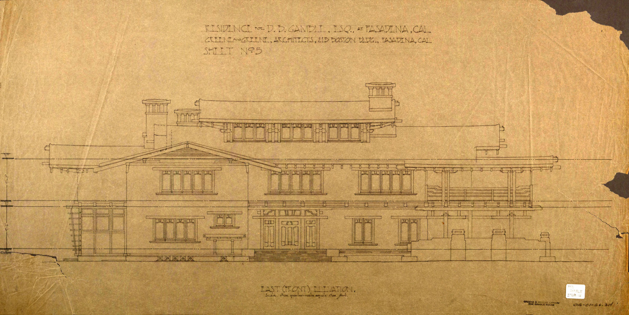
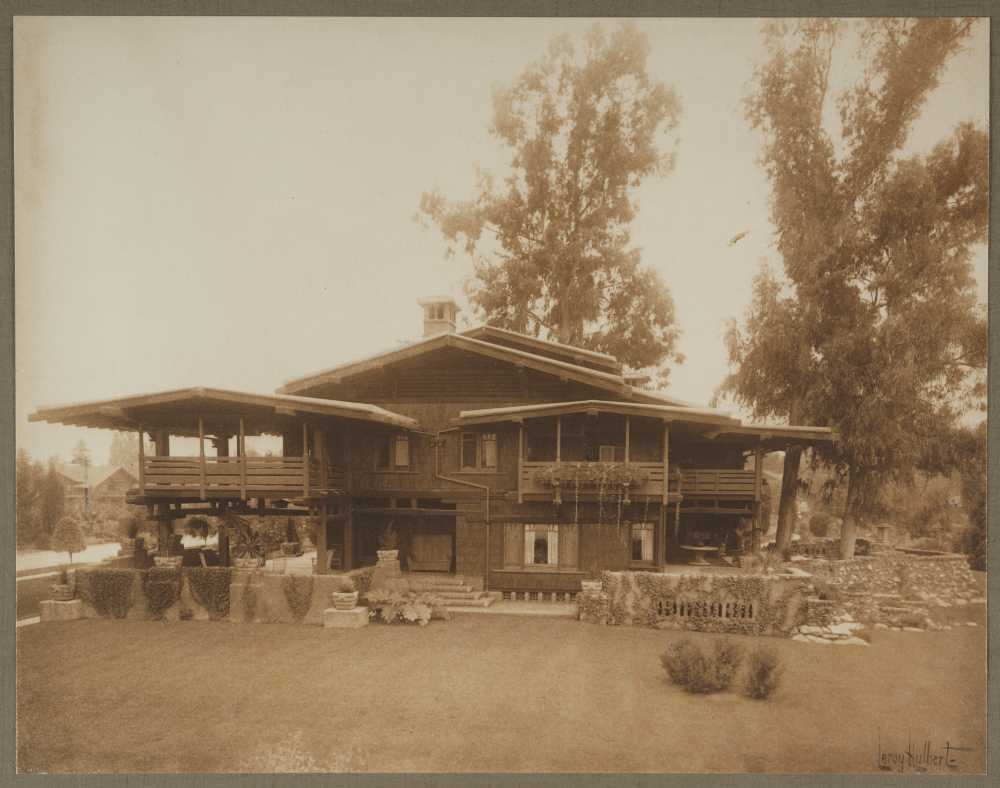
Sometimes I’ll sit in front of a blank page of my sketchbook, pen in hand, coffee poured, for some time with seemingly no idea of what I’d like to draw, what ideas I’d like to explore – an ‘architect’s block’, if you will. To break the silence, I might attempt to draw a floor plan of a house I know in a different style (as in this previous post, where I took the Craftsman Gamble House and reinterpreted in in the spirit of Irving Gill), or try my hand at recalling a house long gone from my personal memories and recollections.
Today’s post is an extrapolation of the latter, taking my grandparents’ sprawling home, which started as a simple 1950’s California ranch, but with multiple ad hoc additions over the years. By placing it on a strict module, the floor plan grew a bit, but I’m happy with the result nonetheless.
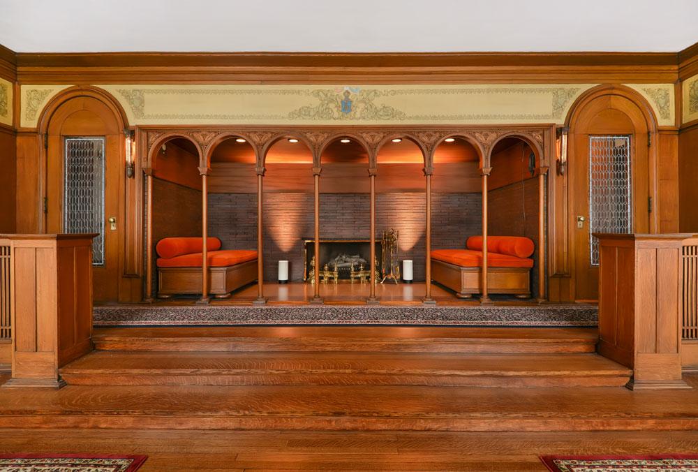
A central entry off of a walled kitchen garden opens directly onto a long corridor that acts as the main circulation spine of the home, with a living/music room to the left and a large kitchen to the right. Further past the living room, the corridor picks up again, with guest bedrooms to each side and a formal library/study at the end. Past the kitchen, laundry and mud rooms flank the corridor with a large master suite at its end. A formal dining room connects the living room and the kitchen, while also creating a patio on one side and pool deck on the other. The detail below is of the central corridor, which meets Edwin Lutyens with Louis Sullivan’s Auditorium Building.


In 1950, Philip Johnson completed a townhome in Midtown Manhattan for the Rockefellers. The simple mid-century modernist gem has become an icon of the halcyon era, with a black steel frame filled with a blind brick first floor and large floor-to-ceiling plate glass windows above, and an open floor plan hiding an exterior courtyard and reflecting pond, with a bedroom suite beyond.
Like most things I enjoy, I’ve re-drawn the project, but on a strict nine-square module and outfitted with a more traditional aesthetic. The brick, not the steel frame, becomes the driving tectonic, with columns in place of sliding plate doors at the courtyard, which itself is centered on a fountain rather than floating around one. The rear bedroom suite is more glorified with a full gable where the hip roof of the main house is tucked behind shallow brick parapets. The front elevation remains rather blind, but trades a single french balcony window for the trio of floor-to-ceiling glass panels.


After taking a little well-needed vacation, I’m back with more frame. Specifically, I’m sharing a continuation of the past two posts – a hillside studio and home. Both of these projects included a small cubic volume topped with a pyramidal skylight. This particular ‘studio’ typology is explored more fully here. While the exterior is a solid white stucco-ed cube, the interior shows a four-square heavy timber frame, with a pair of wood scissor trusses forming a smaller cube at the top, which is itself topped by the skylight proper. Since the geometry is a bit difficult to make out in these projections, I’ll draft up a quick perspective for a subsequent post.


Most often, architects design with ‘plan as generator’, that is we begin designing a building with the floor plan, and derive all the elevations, sections, and even details from it.
Today, though, is something different. This began as an elevation – what you see above. I was thinking something between Adolf Loos and Irving Gill, with a Richardsonian picturesque quality – a ‘character study’ if you will. A rectangular volume makes up the center with a cubic one stepped down to the right and a smaller cube to the left, with a stair tower at the ‘rear’.
The plan – below – came after, trying to work out precisely how the different squares and modules worked together, playing localized symmetries and forms against one another, and eventually placing a formal parterre garden on the upper level with a pool deck on the lower, while a gravel auto court fleshes out the public side of the property.


Small (often illegal) studios riddle the Hollywood Hills, where all ilk of entertainment-oriented folk hash out their hits and edit down their next Oscar-worthy performances. . . or so the stereotype goes.
This is such a studio – a miniature white cube set deep into the hillside with a service shed and private garden adjacent. Upon approach, only the pyramidal skylight is visible, slowly revealing the tall archways underneath upon descending a spiral stair. The form itself owes much to both Irving Gill and O.M. Ungers, with a few picturesque moments from Wallace Neff’s Spanish Colonial Revivalism thrown in for good measure. Upcoming posts will feature the interior of the studio, with that large skylight and intricate trusswork above.

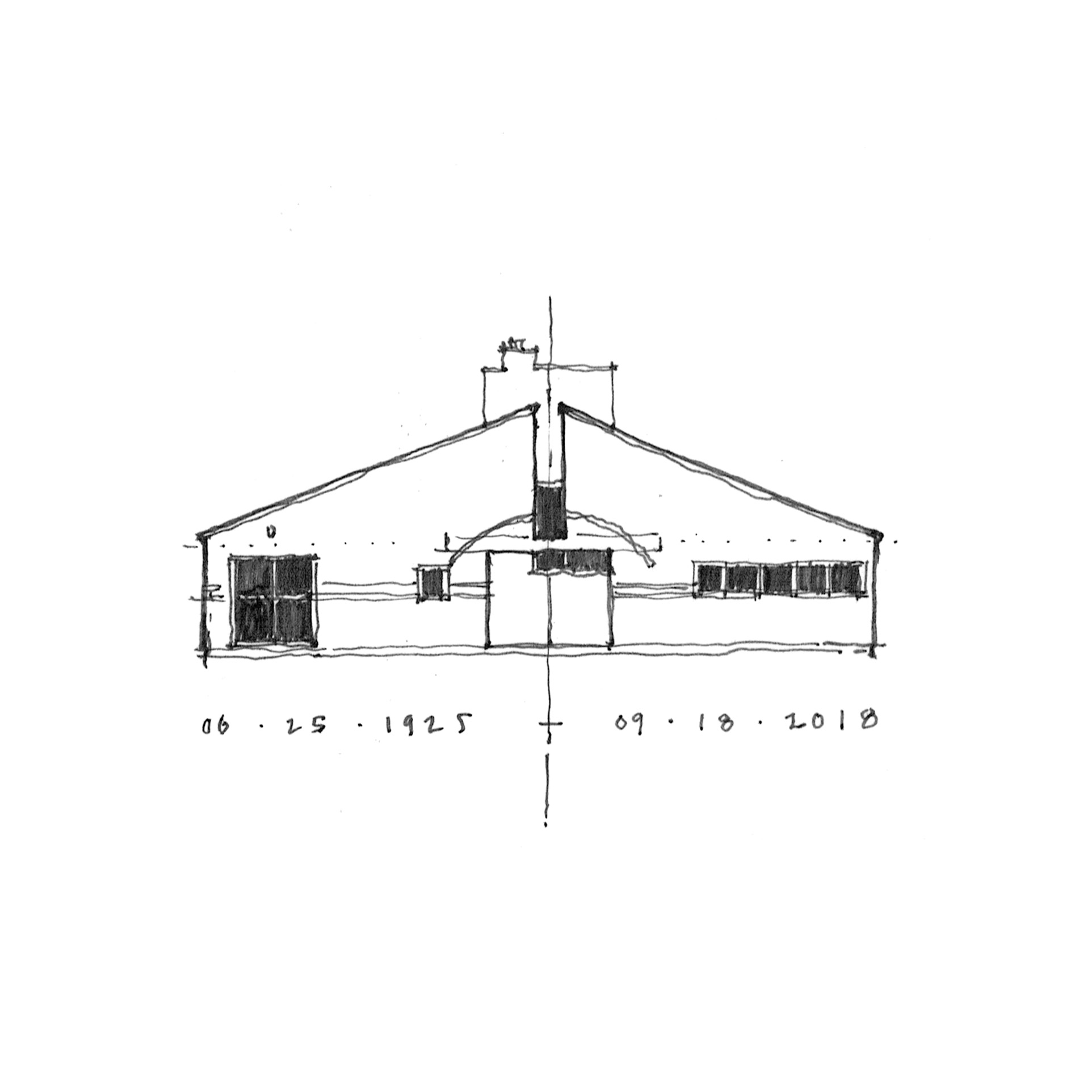
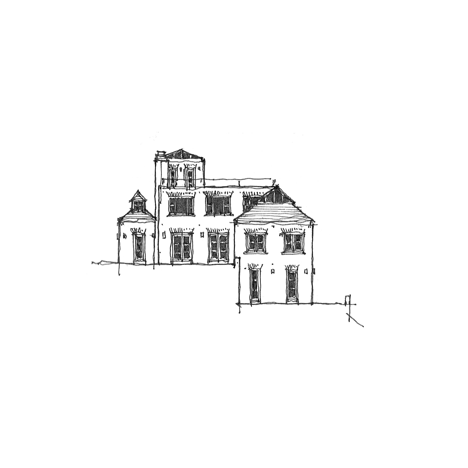
What we have today is a study in similarities and contrasts – two houses, separated by a continent in distance (and climate), two distinct architectural styles (and building materials), and about fifty or so years of time (and appreciation.
The first (up top), is McKim Mead & White’s iconic Low House of 1886 at Bristol, Rhode Island, a long shallow gable of shingles, punctured by a subtle staccato of windows and oriels, all subsumed into the larger singular gable form. The second, Cary Grant’s Spanish Colonial Palm Springs residence of 1930, a shallow stuccoed gable punctured by deep-set windows and shaded by deep eaves and wood porches (now partially obscured by a later Wallace Neff designed addition).*
So naturally, why not try to bang ’em together? My initial reaction (below) is probably more Low than Grant, with protruding bays and banded windows, but is coated in white stucco like its Californian pedigree. I suppose a few more deep-set singular casement windows might just do the trick.

* Apparently, the home was originally constructed by Santa Monica based architect John Byers for one Julian Noles, a recent west coast transplant from Chicago – more info here.

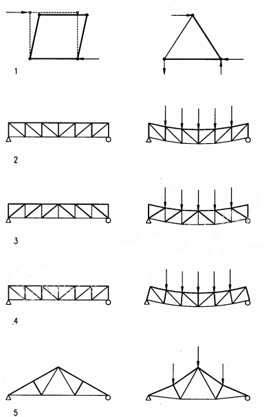
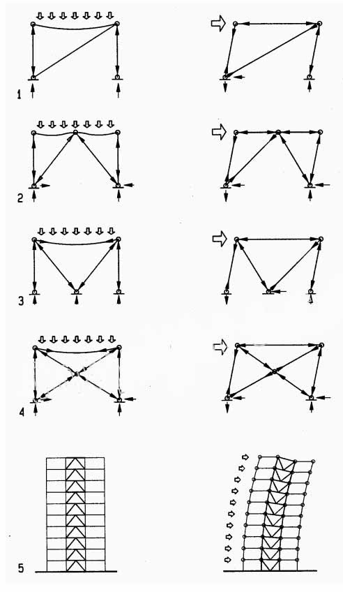
While studying for my last licensing exam, I found some simple and elegant diagrams of different steel frame systems (something like this or this). While the concentrically braced frame has been a hallmark of certain strains of Miesian modernism (Craig Ellwood, anyone? or here), I couldn’t think of an instance where the eccentrically braced frame had made its feature debut. So I drew one. I’ll admit that I had recently had octagon houses on the brain, so that same geometry surfaced here, where the eccentric braces on the four principal facades curve back in on each other to form an interior octagonal form, obscured by the square glazed exterior.


In 1980, Jose Ignacio Linazasoro designed a deceptively simple renovation of a town hall at Segura in the Basque region of Guipuzcoa. While Linazasoro’s current work is of a decidedly modernist vocabulary, his earliest work was more neo-rationalist, taking heavy cues from Rossi and Krier (he even worked in the office of Venturi Scott Brown for a time). The town hall renovation in question reorganized the historic palacio to front an adjacent garden, adding a deep Syrian arch off of a square brick patio, and a long brick-columned pergola overlooking a deep valley and river beyond.
The top drawing outlines the new garden with an idealized ground floor plan of the palacio, while the drawing below is of the square patio itself, complete with herringbone brickwork, stone jointing, and a partial elevation of the archway.


As any casual observer of this ‘drawg’ will note, I have quite an affinity for the vernacular architectures of the Americas. My family’s winter trips to rural Oklahoma have offered me a greater opportunity to acquaint myself with the seemingly endless variety that the vernacular languages offord.
This is yet another home in a barn – yet this time a quonset-roofed barn, where the structural rigidity of the expansive roof comes from its circular geometry rather than the elaborate king-post trusses typical of agrarian structures. The top variation uses shed roof lean-to’s to house ancillary spaces, while placing main living areas under the quonset proper, while the section and plan below explore formal variations on the quonset itself.


The plan above is a direct take on Philip Johnson’s Hodgson House of 1951, at New Canaan, CT. The original is of the same mid-century modernist vein as his own storied Glass House of 1949, also in New Canaan. My version keeps the same U-shaped floor plan, but filled out to take up an entire square, and replaces the focal fireplace wall with a half-round bay. Most dramatically, though, the entire exterior is rendered in brick, including the window openings, which in Johnson’s were a black steel and glass system, no doubt in deep homage to Mies’ contemporary work at IIT, Chicago. A shallow shingled roof completes the traditional restylization, and makes the whole more reminiscent of the earlier Chicago traditions of Richardson & Burnham.


This small home is a take on the shingled row houses of southern New England, particularly by a number of homes I visited on the Rhode Island-Massachusetts border while in graduate school. The volume is a simple cube, wrapped in shingles for three stories, reflected by a nine-square breakdown in floor plan. While the precedent is more humble in its vernacular porch, I’ve given it a more deliberately Grecian portico, with a deliberately pedimented end gable at top. A small ocular window hints at the circular central staircase inside, played against the otherwise rectangular language of the whole.

Having begun my architectural education in Southern California, Mid-Century Modernism (and especially Richard Neutra*) has always held a place of honor in my personal canon – MadMen be damned. Among the Eastern variants of that style, the Harvard Five are most likely the most influential.
Today’s work is a variation on Eliot Noyes’ own home at New Canaan, CT. Effectively, I’ve taken the iconic low-slung, masonry-clad, flat-roofed house and swapped its stylistic elements for more traditional, vernacular ones: an arched entry opens to a colonnaded patio; hip roofs with exposed trusswork sit over the living rooms and bedrooms; and double glass doors replace the sliding panels that so often fail. A brick variation is below, with jack arches in place of the wood trabeation found above.

*Growing up around his buildings at the Crystal Cathedral didn’t hurt either. . .

I don’t know why courtyards intrigue me so much. Perhaps it’s due to my living in the sun-drenched foothills of Southern California, where courtyard typologies have long dotted the land to provide shade in the summer and protect against winter winds.
Today’s project is yet another courtyard house. This time stemming from a relative’s home perched atop the rolling hills of San Diego county. The layout is simple: A small patio protects the front door (to the left on the drawing), with a living room just beyond, a dining room to the right, and the kitchen and family room further yet; to the left are bedrooms and baths, with a stair down to a lower level tucked into the hillside below; a central courtyard is flanked by a covered patio which opens onto tiered terraces and stairs beyond.
Formally, my initial studies (below) were rather rectangular, with only one oriel window at the family room. However, I couldn’t resist the fun a pinwheel-ed series of oriels would provide, lending one each to the family room, the master bedroom, a guest bedroom, and the dining room. Here the plan takes cues from McKim Mead & White’s two casinos at Newport (also here) and Narragansett, with a dash of the Bell House (also here). The bottom sketch further investigates a circular series of stairs at the patio, referencing the predominance of half-round oriel figures in the remainder of the plan.


Some time ago, I shared a very Irving-Gill-dependent rectangular home with a wrap-around arcaded veranda. Today, I’m offering a new take on that plan – taking a cue from the Shingle Style and rounding out the corners of the veranda, and subsuming the whole under a large, steeply pitched hip roof. Here, the veranda is more closely tied to the rectangular volume behind it, rather than merely acting as a stand-alone wrapper. Personally, I find both equally interesting, but I’ll let you take your pick.


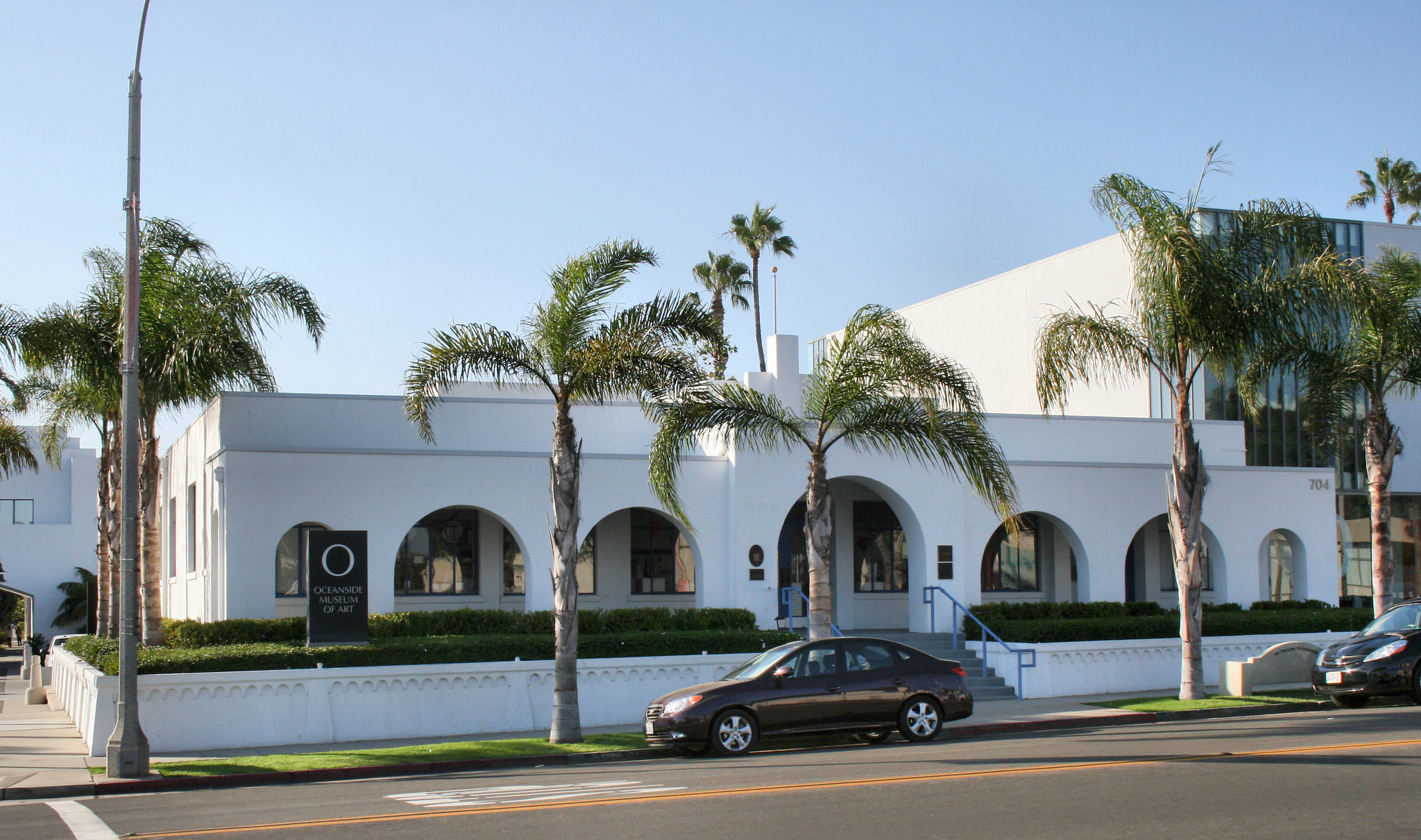
There’s a single family house in my neighborhood that was at one time wrapped in a deep arcade. Though rotting and falling apart (and no doubt unpermitted), the regular rhythm of the arches masks the asymmetrically placed windows and doors behind. I tied this with Irving Gill’s Oceanside City Hall of 1934 (also here), which uses an arcade in a similar fashion, to regularize an otherwise syncopated facade.
Today’s project takes Gill’s more refined use of the arcade and applies it to the single family home, a typical, asymmetrical, single story, home not unlike many here in Southern California (and indeed in many suburban neighborhoods). This results in some interesting conditions, with some occupied spaces pushed right up behind the arcade while leaving shallow porches elsewhere, and even enclosing a small garden within its bounds.
The options below take the same floor plan of above, but add a second floor, positioning the arcade proper against taller volumes behind.


Today’s project takes its impetus from the tithe barn (Fr. grange dimiere), medieval structures used to collect villagers’ tithes, which prior to the proliferation of cash was often given as a portion (one tenth) of the individual’s harvest. These cumulative tithes required an elaborate barn to store them for safekeeping throughout the following year. The structures are fabulous syntheses of the ecclesiastical and the secular – large, windowless stone or brick fortresses with soaring trussed, nave-like, roofs.
Barn conversions are fascinating to me, with the domesticization of the agricultural, and the tithe barn is no less so. This project attempts to take the typical tithe barn and meet it with the domestic, with a large enclosed courtyard to compliment the truss-framed living room.


Staring at a blank sheet, knowing that I want to draw something, just not knowing what to draw, sometimes I try to draw the plan of a house from memory. This particular day I was musing over Greene & Greene’s seminal Gamble House, the high water mark of the California Craftsman bungalow. But being my own self, obsessed with modules and keeping things on grid, I drew it a little differently, quickly observing a plan that reminded myself more of Gill than Greene. So I ran with it. White stucco replaces darkened shingles; Rectangular parapets take the place of deep Japanese-inspired gables; Minimally appointed Italianate colonnades take over for iron-wrapped wood posts. What we’re left with, while deriving from the Gamble House no doubt becomes something completely different, yet all the while essentially Californian.


Two more takes on the Victorian-anomaly-Octagon-house. The first is octagonal at the core, with square rooms off of four corners, connected by intermediary porches to form more of a chamfered square at the ground floor, while the octagon proper pierces out at the second story, topped with a tall, Rossi-an turret. The second is more subtle, placing a gabled roof on top of an octagonal plan, with porches on either side at the ground floor.


I like circles. I like squares. I like circles and squares together. This is a gazebo. It has a square brick base with four Tuscan columns. These support a circular lintel with conical purlins. The drawing below does not have a circle. It is kind of boring.
That is all.


I think through drawing; I interpret as I reproduce. The drawing above perfectly capture this, where I set out to draw an accurate representation of an existing floor plan and ended up drawing what I wanted to see. The project in question is Frank V. Klingeren’s T-Karregat Center in Eindhoven, of 1973. The original is a system of steel truss ‘trees’ that serve as both structure and building systems, in some Reyner-Banham-dream-come-true, culminating in large pyramidal skylights that provide the majority of the light to an otherwise free plan interior.
My interpretation keeps the modular system, but lays it out in a rigor more reminiscent of early SOM (Mitchell Hall at the US Air Force Academy), and imagines it rendered in popular-once-again heavy-timber framing. The drawings below investigate the basic modularity, the nine square, and centering.


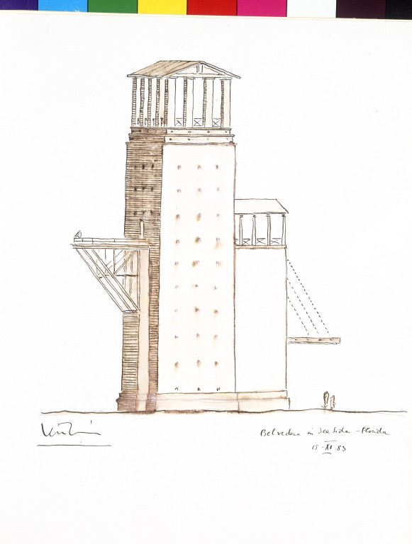
Today’s post takes its impetus from a number of geometric games I’ve been playing with myself recently – the staircase moves from a circle to a square in plan, the tower moves from a square to a circle in elevation, the staircase moves from a rectangle to a circle as it moves from floor to floor. Programmatically, it is a take on Krier’s belvederes, which crop up again and again in his oeuvre (and again, and again, and again, and again, and again. . . ).
Recent Comments