by nscoleman | Jun 7, 2018 | entire buildings, precedent

In 1950, Philip Johnson completed a townhome in Midtown Manhattan for the Rockefellers. The simple mid-century modernist gem has become an icon of the halcyon era, with a black steel frame filled with a blind brick first floor and large floor-to-ceiling plate glass windows above, and an open floor plan hiding an exterior courtyard and reflecting pond, with a bedroom suite beyond.
Like most things I enjoy, I’ve re-drawn the project, but on a strict nine-square module and outfitted with a more traditional aesthetic. The brick, not the steel frame, becomes the driving tectonic, with columns in place of sliding plate doors at the courtyard, which itself is centered on a fountain rather than floating around one. The rear bedroom suite is more glorified with a full gable where the hip roof of the main house is tucked behind shallow brick parapets. The front elevation remains rather blind, but trades a single french balcony window for the trio of floor-to-ceiling glass panels.


by nscoleman | May 1, 2018 | entire buildings, precedent

What we have today is a study in similarities and contrasts – two houses, separated by a continent in distance (and climate), two distinct architectural styles (and building materials), and about fifty or so years of time (and appreciation.
The first (up top), is McKim Mead & White’s iconic Low House of 1886 at Bristol, Rhode Island, a long shallow gable of shingles, punctured by a subtle staccato of windows and oriels, all subsumed into the larger singular gable form. The second, Cary Grant’s Spanish Colonial Palm Springs residence of 1930, a shallow stuccoed gable punctured by deep-set windows and shaded by deep eaves and wood porches (now partially obscured by a later Wallace Neff designed addition).*
So naturally, why not try to bang ’em together? My initial reaction (below) is probably more Low than Grant, with protruding bays and banded windows, but is coated in white stucco like its Californian pedigree. I suppose a few more deep-set singular casement windows might just do the trick.

* Apparently, the home was originally constructed by Santa Monica based architect John Byers for one Julian Noles, a recent west coast transplant from Chicago – more info here.
by nscoleman | Apr 23, 2018 | precedent

In 1980, Jose Ignacio Linazasoro designed a deceptively simple renovation of a town hall at Segura in the Basque region of Guipuzcoa. While Linazasoro’s current work is of a decidedly modernist vocabulary, his earliest work was more neo-rationalist, taking heavy cues from Rossi and Krier (he even worked in the office of Venturi Scott Brown for a time). The town hall renovation in question reorganized the historic palacio to front an adjacent garden, adding a deep Syrian arch off of a square brick patio, and a long brick-columned pergola overlooking a deep valley and river beyond.
The top drawing outlines the new garden with an idealized ground floor plan of the palacio, while the drawing below is of the square patio itself, complete with herringbone brickwork, stone jointing, and a partial elevation of the archway.

by nscoleman | Apr 10, 2018 | entire buildings, precedent

The plan above is a direct take on Philip Johnson’s Hodgson House of 1951, at New Canaan, CT. The original is of the same mid-century modernist vein as his own storied Glass House of 1949, also in New Canaan. My version keeps the same U-shaped floor plan, but filled out to take up an entire square, and replaces the focal fireplace wall with a half-round bay. Most dramatically, though, the entire exterior is rendered in brick, including the window openings, which in Johnson’s were a black steel and glass system, no doubt in deep homage to Mies’ contemporary work at IIT, Chicago. A shallow shingled roof completes the traditional restylization, and makes the whole more reminiscent of the earlier Chicago traditions of Richardson & Burnham.


by nscoleman | Dec 13, 2017 | entire buildings, precedent

I think through drawing; I interpret as I reproduce. The drawing above perfectly capture this, where I set out to draw an accurate representation of an existing floor plan and ended up drawing what I wanted to see. The project in question is Frank V. Klingeren’s T-Karregat Center in Eindhoven, of 1973. The original is a system of steel truss ‘trees’ that serve as both structure and building systems, in some Reyner-Banham-dream-come-true, culminating in large pyramidal skylights that provide the majority of the light to an otherwise free plan interior.
My interpretation keeps the modular system, but lays it out in a rigor more reminiscent of early SOM (Mitchell Hall at the US Air Force Academy), and imagines it rendered in popular-once-again heavy-timber framing. The drawings below investigate the basic modularity, the nine square, and centering.

by nscoleman | Nov 9, 2017 | entire buildings, precedent
A few weeks ago, I posted a quick sketch of a Classicized version of Le Corbusier’s Five Points. That post in turn had been influenced by the work of Leon Krier. Today, Leon has agreed to share with you some yet unpublished drawings, his own revisiting of Le Corbusier’s seminal Villa Savoye.
This is the mecca of Corbusian modernism, and Krier takes no small shots, recontextualizing the villa by relocating it on the site, extending a large walled garden at one end, and bringing the roof garden to a climactic belvedere.
Krier keeps Corb’s basic Five Points right in place, but deftly moves them about: placing the piloti on a massive, battered base; adding more forms to the sculptural roof garden; and making a feature out of the ‘free plan’ curve at ground level. Corbusier is still here, but so is Krier.
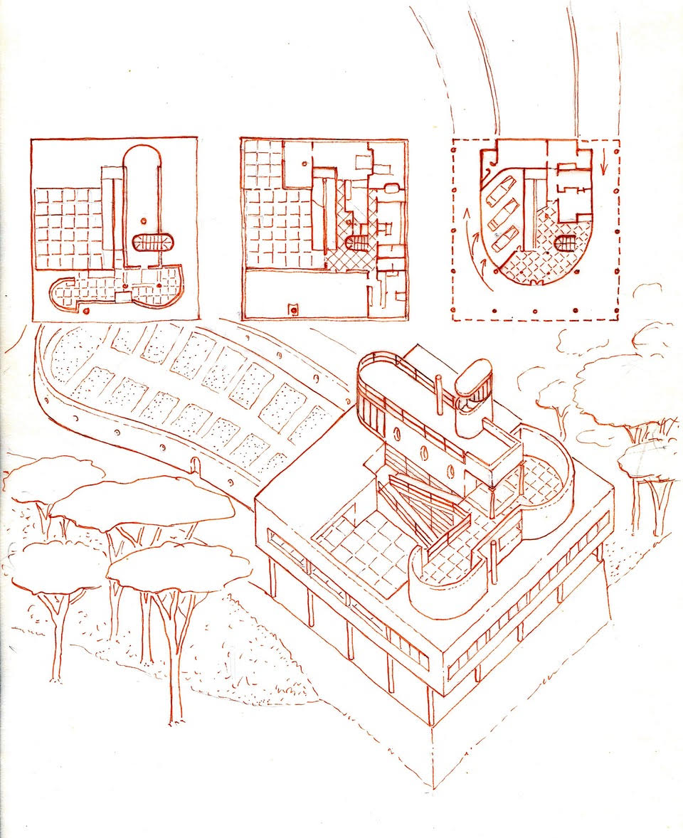
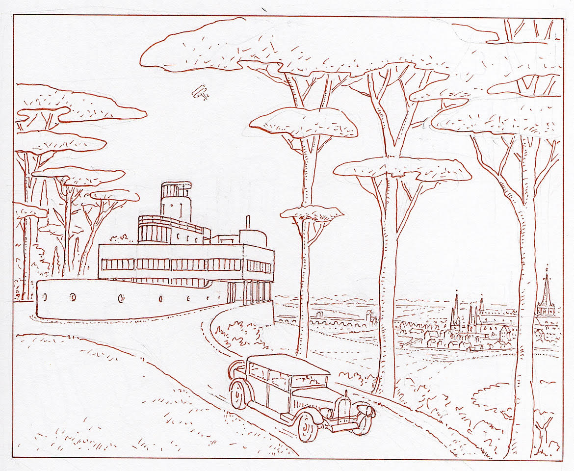
All work is graciously lent by Leon Krier, who maintains his copyright © 2017.
by nscoleman | Sep 19, 2017 | precedent

Today, merely an elevation and roof/floor plan of a simple structure Edwin Lutyens designed at Middleton Park, where a pair of these cubic houses form the gatehouse entry to a much larger country estate. Why I enjoy it, and why I represent it here, is because it is one of Lutyen’s only square/cubic projects, where the picturesque goes to the wayside in an exercise of formal purity. A large hip roof mounts the brick and stone Georgian base, where two dormers are set aligned with the windows beneath on two sides, and one dormer is centered on other two. A large central chimney sprouts from the ridge. The house itself is built into a larger gate, with two eagles perched atop, flanking the gateway.
Apparently, you can live in one . . .
by nscoleman | May 19, 2017 | entire buildings, precedent

In penance for doing little posting of late, I present you with a little precedent study, and an archaeological one at that. Burnham & Root’s Armory Building (Chicago, 1882), was demolished in the 60’s, and Richard Nickel’s photos are little of what remains to tell the epic story of this impressive structure. Predating the Monadnock Building by 9 years, the simple masonry volume is rather unornamented, save for the excellent brickwork and rough-faced battered stone. A large skylit central drill hall anchors the form, which gives only small fortified slit windows to the street, save for the large, Richardsonian Syrian arch at the main entry. The windows pre-echo Kahn, but I’m not going to argue that he was so influenced, no matter how hard I’d like to. The structure is framed by the large load-bearing masonry walls, which are filled with long-span trussed arches, which allow for the large hall at the center. My first (failed) attempt at a truly square floor plan is at the bottom.


by nscoleman | Apr 27, 2017 | precedent

Oregon has a large number of covered bridges, where the wood trusses had to be protected from the persistent damp and subsequent rot and failure. These are simple, rectangular, white clapboard (or board & batten) gabled ‘houses’, concealing impressive, large-scale Howe trusses inside. I find engineered structures to have a brutal beauty, especially those of the early 20th Century, and often believe the Historic American Engineering Record to be much more fascinating than its architectural counterpart. These covered bridges offer a wonderful contrast between the utilitarian trussed interiors and the domestic exterior form. There might just be another project somewhere in there. . .

by nscoleman | Mar 9, 2017 | entire buildings, precedent

Three ‘k’s. Three drawings. Three ideas:
Kahn – an homage to Louis I. Kahn’s Center for British Art at Yale, where one of his pyramidal concrete skylights is placed above a more classically detailed library, contrasting the stark materiality of his modernism with the richness of the English country house which inspired it.

Krier – Starting with a plan very much like Wright’s Charnley house, but facing its street façade with a stuccoed language taken from Leon Krier’s Perez Architecture Center at the University of Miami, all for the domestic scale of the single family home.

Kiosk – Almost an exact reduplication of a small Tokyo ‘warehouse’ featured in a book by Atelier Bow-wow, ‘Pet Architecture Guide Book’, with a triangular floor plan topped by a butterfly roof, centering the downspout on the front façade. All I’ve done is perfect the geometry and replace a roll-up garage door with a french glass door.
by nscoleman | Sep 16, 2016 | precedent

Driving through El Segundo the other week, I ran across a nice Miesian office block. A quick internet search for the name ‘Xerox’ which was left stained on a concrete wall and I stumbled across an all too familiar name – Craig Ellwood (Originally built for Scientific Data Systems, which was later bought out by Xerox). A floor plan confirmed my suspicions – a perfect square on 64 columns, raised one floor off the ground with a directional access given by two long walls on the east and west facades, and storefront gazing on the north and south, all centered on a cubic central atrium. The details are almost perfect derivatives of Mies’, but the vertical window mullions stop at the spandrel panels rather than continue full height as MVDR would have done (see Murphy’s Daley Center compared with Mies’ IBM tower). The whole project is undergoing a less than inspiring renovation by SOM, with absolutely no heed for the building module and planted ‘green’ walls. Too bad.


by nscoleman | Aug 24, 2016 | details, precedent

I had wanted to draw this while we were on site, but the monk who was giving us a tour was moving at a brisk rate. This is the entrance pavilion to Aalto’s Library at Mount Angel, as previously featured here, and is worth featuring because of the inherent classicism of it all – strictly modular, rigidly symmetrical (minus that one angled wall on the right), with a well-coordinated ceiling plan, brick floor patterning, column placement, and door/storefront alignment. For the über-modernist Aalto, this is proof that his early education in Nordic Classicism never truly left. Details below.

by nscoleman | Aug 23, 2016 | details, precedent

Three buildings I saw while driving cross town = three quick elevation studies: A symmetrical hip-roofed house with a long continuous masonry wall that continues to form a low wall on the rear yard; A series of openings on a flat stucco wall, centered on one large square picture window (the jack arches are my own); A square light well lined with industrial sash windows, and a clapboard volume beneath.
by nscoleman | Aug 1, 2016 | details, precedent

Alvar Aalto has only three built structures in the United States: a dormitory at MIT, an interior on Manhattan, and a library at a Benedictine Abbey in Mount Angel, Oregon. These few drawings are my rapid attempt to distill some important moments from the Abbey library, which I visited on a recent trip up the Pacific coast: A section through the skylit split-level reading room, and a plan beneath; a detail section through a typical study desk, which run the length of the double-height spaces, eliminating a traditional guardrail; and a detailed plan of a glass partition at independent study carrels, with hollow-steel-section framing members and wood stops – a beautiful, humane, change to the typical Miesian system. There was so much more, but unfortunately so little time.
by nscoleman | Jul 29, 2016 | precedent

My wife and I drove the coast on our way back home from Portland, and we stumbled upon an lighthouse along the Coquille river in southern Oregon. I was struck by the simple forms rendered in white plaster: the tall cylindrical light and a low lozenge-shaped accessory building. These were both detailed in a pseudo-French collection of mannered profiles and mouldings, with large cyma-ed keystones and segmental arches, and iron king-rod trussed roof construction. Civic work today pales in comparison.
by nscoleman | Jul 28, 2016 | precedent

What would a frame roadtrip be without a little precedent study? Case 1 – the infamous, amazing, polarizing, kickass Portland Building. And just to show you that drawing is a learning process, complete with error, the front elevation shown above incorrectly correlates the stepped entrance pavilion and the Portlandia statue it rests on – hence the small partial elevation underneath it. Below, I highlight a discrepant exterior and interior window in elevation and section as well as interior tile ‘wainscotting’ and an exterior arcade.

by nscoleman | Jul 13, 2016 | details, precedent

My wife and I took a short trip to Machado Silvetti’s Getty Villa a few months ago. I brought along my sketchbook and put down a few details, ideas, or forms that I found fascinating – from the archaeological ‘Roman’ architecture of the Villa proper, Machado Silvetti’s modernist interventions, or the ancient Roman and Greek antiquities housed inside, including that splendid bronze staircase (underside of risers and stone handrail).

by nscoleman | Jul 7, 2016 | details, precedent

This post is simple – the building is simple. This is a small motor pavilion at the Empress Hotel in Victoria, BC. The neo-gothic style of the main hotel is reinterpreted in a small square glass and iron pavilion. What I’m showing here is merely there clerestory roof volume with half of a reflected ceiling plan and an elevation. The copper standing seam roof has aged wonderfully on the salty bay air.
by nscoleman | Jun 24, 2016 | details, precedent

In a seeming break with the previous two Price projects that were relentlessly symmetrical and modular. This project would seem to diverge – seem to. The reality is that this cottage is just as systematic as the previous two, but its symmetry is diagonal rather than axial, and its modularity is only shifted one half bay to turn a regular square plan into a rectangular one. The ground floor is all ashlar cut stone, while shingles cover nearly everything else. A large tower takes up one corner, where the ashlar rises up into the second story, even to the third at a small circular corner column – see wormseye axonometric below. Rounded corners abound – a continuous wrapping surface of shingles consumes the rigid geometry.

by nscoleman | Jun 23, 2016 | precedent

Once again, Price regulates the picturesque qualities of the Shingle Style on a strict module and with intense symmetry. Two chimneys dominate the principal facade, which has a Richardsonian Syrian arch dead center, flanked with expansive glazing and shingled balconies on the sides, which top long portico-ed porches. The symmetry only breaks at the entry facade, where a small porch sits next to the stair hall.
by nscoleman | Jun 22, 2016 | precedent

Today I’ll start a short series on four summer cottages located in Tuxedo Park, NY, by Bruce Price, who also designed numerous other buildings in the masterplanned community. This cottage of 1886 takes the aesthetics of the Shingle Style, but meets them with a rigid modularity and symmetry. More to come.
by nscoleman | Jun 13, 2016 | precedent

An unbuilt project for a crematorium complex at Malmö, Sweden. Three conical brick chimneys top square window-less boxes, with small temples linking them one to another. An elongated temple-fronted portico acts as the formal entry at the center volume.
by nscoleman | Jun 9, 2016 | precedent

I can be terribly repetitive. My sketchbooks will tell you that, where dozens of imperceptibly different iterations of a single project follow one another, page after page. Similarly, when I start down a trail of inquiry I’m soon immersed. And when I start drawing, I go on and on. So is my fascination with Henry Hobson Richardson – and I’ll share three different pieces from my studies: Top, von Herkomer Residence, 1886; Below, Ames Memorial Library, 1877; Bottom, Trinity Church Rectory, 1880.


by nscoleman | Jun 6, 2016 | precedent

Or rather, his Singakademie sings. . . or something like that.
A standard basilica form sits completely within a Greek-gabled stone volume, but with a wonderful circular stepped dias for the vocalists (er, singers). This circular form is duplicated in the barrel vaulting at the ceiling. A Doric peristyle surrounds. I’ve overlaid plans, sections, and elevations on one another to show the full effect. A similar theme pervades the church design shown below.

by nscoleman | Jun 1, 2016 | precedent

A golden oldie from Michael Graves’ heyday – this small townhouse or ‘carriage house’ is a perfect example of Graves’ mastery of the floor plan. Say what you want about his elevations, but his plans are money, and the enfilade depicted here is extraordinary. The foyer is an autonomous tempietto-like volume, with a walk-through library preceding the full-width living room to one side, and the kitchen-dining room volume to the other, with a long pilastered hall beyond flanked with a study and guest bedroom, while the master bedroom opens onto a patio.





Recent Comments