by nscoleman | Nov 9, 2017 | entire buildings, precedent
A few weeks ago, I posted a quick sketch of a Classicized version of Le Corbusier’s Five Points. That post in turn had been influenced by the work of Leon Krier. Today, Leon has agreed to share with you some yet unpublished drawings, his own revisiting of Le Corbusier’s seminal Villa Savoye.
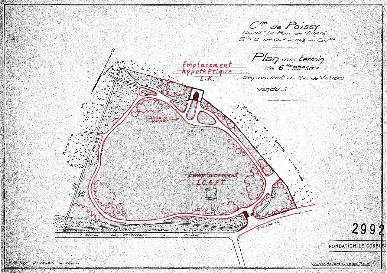
This is the mecca of Corbusian modernism, and Krier takes no small shots, recontextualizing the villa by relocating it on the site, extending a large walled garden at one end, and bringing the roof garden to a climactic belvedere.
Krier keeps Corb’s basic Five Points right in place, but deftly moves them about: placing the piloti on a massive, battered base; adding more forms to the sculptural roof garden; and making a feature out of the ‘free plan’ curve at ground level. Corbusier is still here, but so is Krier.
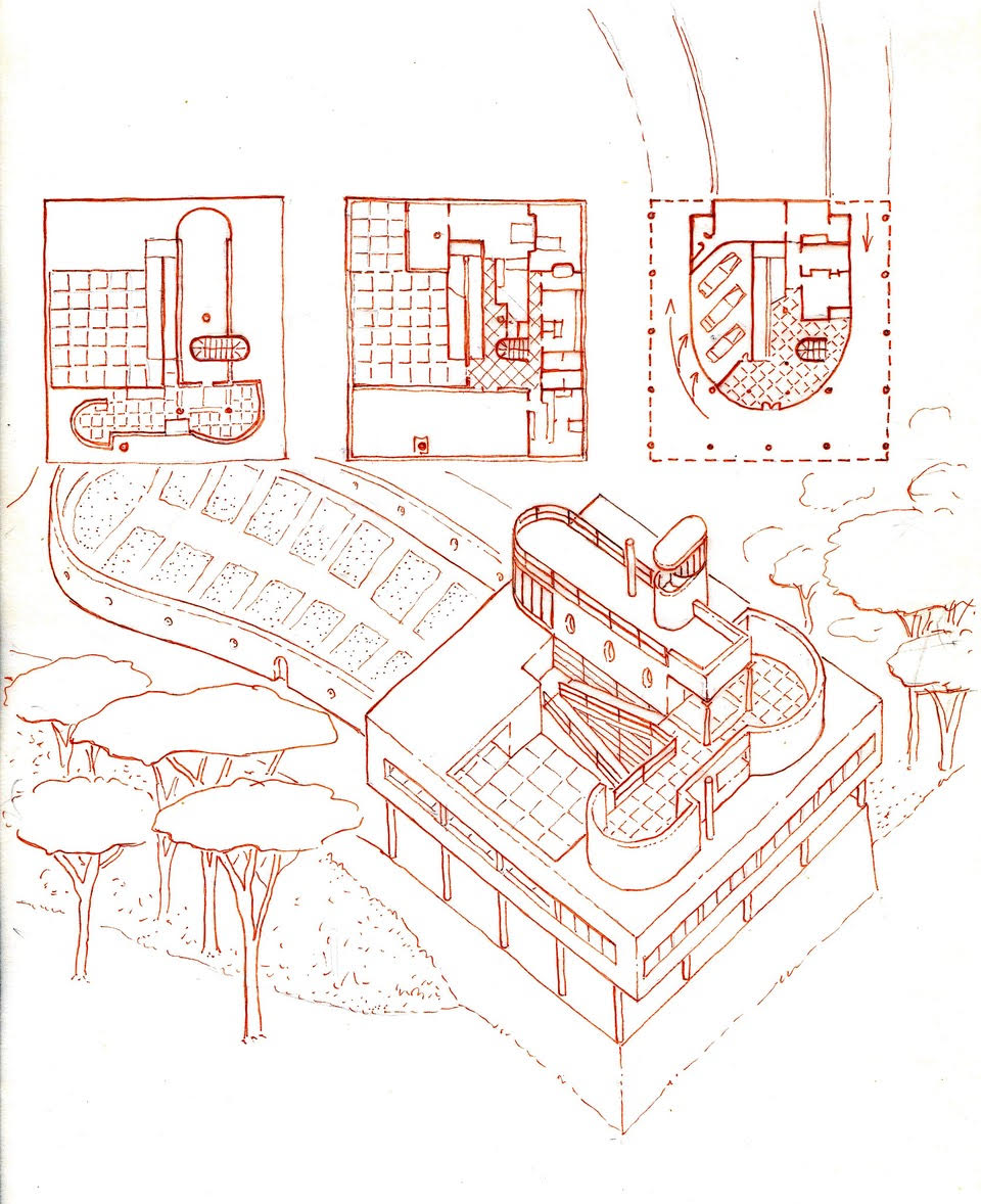
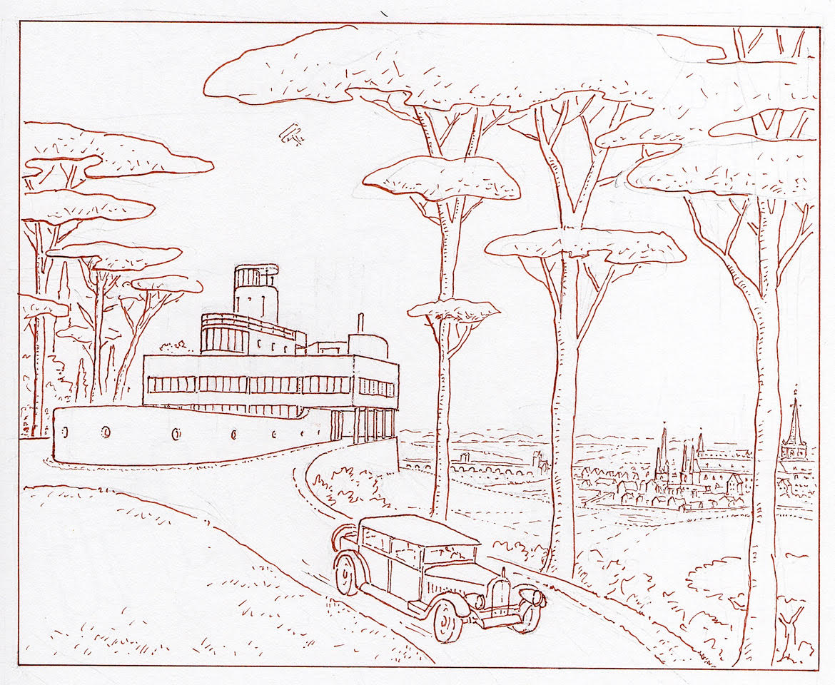
All work is graciously lent by Leon Krier, who maintains his copyright © 2017.
by nscoleman | Oct 30, 2017 | entire buildings

Leon Krier always has an interesting point or two to make with regards to Le Corbusier, most likely due to Corb’s immense power over Krier’s earliest work and schooling. In many ways, Krier’s career can be seen as one long extended dialogue with (and often against) the Modernist figurehead. As part of that, Krier has recently talked about a resurgence of those five points against which Corb wrote his – and argued that these five points ought to form the core of a vernacular traditionalism, much in the same way Corb’s have loomed over the moderns.
So I figured I’d take a synthetic middle ground. What happens if we take Corb’s five points and dress them up in traditional garb. What then? Piloti are given bases and capitals (and become columns); picture windows are gathered into long fenetre en longueur; the plan is libre (free of rooms en filade); the roof is flattened to host a garden; and the only point I’m probably missing is the free facade. O well, better luck next time. . .

by nscoleman | Oct 27, 2017 | entire buildings

Or is it just glorified trailer? Oh, let’s not quibble over semantics, shall we? You’re here for pretty pictures. Well, what I have here is a small ‘home’, a tiny home, rather.
There is a whole market out there that is centered around this new class of detached homes for those without the budget for a conventional suburban home, or those who would seek to lessen their actual footprint on the earth in addition to their carbon footprint. What I find interesting is the challenge of fitting all the normal homey things into a smaller package, wrapping that package around conventional building modules, and yet still fitting it into Department of Transportation standards for a ‘mobile’ trailer.
My thoughts ramble between two or three eight-foot cubes, all topped with pyramidal roofs and skylights, and jam-packed with foldable shelving, hidden beds, and all the other hoopla that comes with a ‘tiny home’.


by nscoleman | Oct 17, 2017 | entire buildings

Sitting in a local coffee shop, I began to wonder the great ‘what if’, and sketched out how I would have solved the problem. Starting with a square (shocker), I drew out a central nave, complete with side aisles and a high altar – a wall of single origin small batch coffees complete with a cash wrap. Sculptural skylights cut into the ‘nave’, while exposed lamps hang along the bottom of the ‘aisle’ soffits, not unlike old theatre marquees. Grab a cup. Stay awhile. Amen.
by nscoleman | Oct 3, 2017 | entire buildings

Two rooms with a passage down the middle – the typological dogtrot house. Here, I’ve begun to play with the articulation of the central ‘trot’, articulating it with an English hammerbeam truss above. Below, a slightly more refined study, with two different plan interpretations of the elevation at the top, as well as two different studies for the cupola at the central passage.

by nscoleman | Sep 29, 2017 | entire buildings

Today, a barn, a square, and some fun with drawing projections. If you’ve spent any time looking at my posts, you’ll know that I have a penchant for vernacular architectures, especially the banal agricultural buildings that dot the majority of America’s varied landscapes. The barn is probably the epitome of those forms, and heavy timber framed barns seem to more or less rise from the earth itself.
This particular barn is my interpretation of the timber framed variety, with my love of formal rigor – the square. The plan is a large four-square frame, with a double-wide central ‘nave’ and two single-wide ‘aisles’. Large, folding doors frame the ends, with small punched windows the sides. Since this barn is not intended to be utilitarian, the flooring is gridded black basalt pavers, with two large concrete decks on either end.
The drawings are all halves – the plan is half floor plan, half roof plan; the axonometric is half aerial, half wormseye; the oblique axon is also half & half; the elevation is half the side, half the front.


by nscoleman | Aug 23, 2017 | details, entire buildings

Above, a small pavilion built into a wall, which I imagine could extend quite some ways beyond where I’ve drawn it. The roof, a tall shingled pyramid.
Below, a roof that modulates between a square base and a round oculus at the crown, again figured as a tall, shingled pyramid.
Come to think of it, what if we combined the two, a really long wall with a larger rotated square pavilion cut out of a portion of it (and I mean, big, like Krier big), topped with a tall, oculus-ed, pyramid? Maybe tomorrow.


by nscoleman | Aug 14, 2017 | entire buildings

Today’s project is a nine-square pavilion that is organized along the diagonal, with two opposite corners rounded off, one side a wall, the other a colonnade. An oculus centers the pavilion, inside the trabeated coffered ceiling. A diagonal section, perpendicular section, combo womseye oblique axonometric, and oblique wormseye axonometric round out the representations.


by nscoleman | Aug 3, 2017 | entire buildings

From Donald Judd and the architecture of art last week, I bring another tangentially architectural enterprise today: set design. This work came about through viewing terribly underwhelming sets at the local opera. My thoughts began to race about how the story could have been more magnificently communicated through architectural form rather than a few gauzy curtains. This version positions a continuous brick jack arcade along the entire upstage, with four brick ‘el’s that could move about in the foreground, turning towards the audience for an ‘interior’ perspective, or away for the ‘exterior’, or alternated in-and-out, aligned into two open ‘rooms’, or one closed off cube. Allusions to the work of Edward Gordon Craig, Adolphe Appia, and Richard Peduzzi abound.

by nscoleman | Jul 28, 2017 | entire buildings

This project attempted to talk to both the vernacular-traditionalism v. minimal-modernist dichotomy and the art v. architecture dialogue, taking one of the central figures of American modern art (and himself an influential figure to many American modern architects) and running him alongside a long history of American traditional vernacular form.
I took a simple, three-square concrete sculpture of his, untitled (1991), and rendered it in the most prototypical of American vernacular architecture, clapboard. One rendition maintains the homogeneity of Judd’s concrete as a single clapboard volume (‘abstraction wrapped in ‘vernacular’ ‘), and the other rendered as a full building, with a shingled roof and brick foundation (‘abstraction become vernacular’).

by nscoleman | Jul 27, 2017 | entire buildings

This is a simple, ‘shotgun’ home, with two porches flanking either side, and a large central room in the middle, accentuated by the ‘dutch’ gable of the roof. The ‘opposites’ so named in the post’s title indicate that the ground floor has open porches on the ends with a solid middle, while the semi-enclosed basement has the opposite: enclosed ends and an arcaded middle. This came about through a simple drawing, shown above, where the same parti could easily be rendered in either formation – so why not do both? That hybrid elevation is below, where the opposition of the two systems results in a ‘checkerboard’ pattern, not too dissimilar from Lutyens’ own, larger, experiments.

by nscoleman | Jun 29, 2017 | entire buildings

Today’s post is a small pavilion, four-square with on-center columns at each facade, radius-ed corners, each topped with a miniature turret and blended into a larger hip roof. Bits of Richardson clash with modernist modularity, postmodern idiom, and multiple readings in the plan (a diamond? a cruciform? nine-square even?). While I’ve drawn the exterior in brick, it could work wonderfully shingled or in clapboard, perhaps even stucco.


by nscoleman | Jun 26, 2017 | entire buildings

Another Gill-inspired project, this time taking planometric cues from Ungers, with a large central hall that cuts through three stories to a pyramidal skylight atop, wrapped in a continuous arcaded portico all around. Maybe this one could do with killer attic spaces, for a fourth floor.
by nscoleman | Jun 23, 2017 | entire buildings

Or rather, I drew more of the same courtyard I’ve drawn before. Particularly, I wanted to see how this plan-section combination would work with my double-axon-section projection (see above). I especially like how the section proper gets lost in the projecting planometric linework, both from the wormseye and the traditional ‘aerial’ axonometric.

by nscoleman | Jun 20, 2017 | entire buildings

Linguistics, or the study of language, is today’s topic, expressed in four buildings: On the left, traditional languages are used to express a four square plan (top), and a nine square plan (bottom), with floor plans on the left and ceiling plans on the right. On the right, modernist languages express the same four square (top) and nine (bottom), with symmetrical plans on the left and directionally symmetrical plans on the right – mainly because modernist ceiling plans are far less interesting to draw. . . A section and elevation lie beneath.
by nscoleman | Jun 19, 2017 | entire buildings

To celebrate my birthday, my wife took me to see over 20 of Irving Gill’s extant works. I’ve always appreciated this seminal figure, and his lasting impact upon Southern California’s architectural development, but had never taken it upon myself to actually seek out his work in person. Lesson learned. And as much as I appreciate precedent study, that is the representation of existing works through drawing, I believe that history must be operative – that is, we must look to how history can work for us today. Not only what we can learn from it, but what we can do with it.
And with that introduction, I give you a small house, three squares in plan, stepped in section, cubic in volume. The articulation of the volumes is typical Gill, with an arcade wrapping the a portion of the ground floor as a screen, yet open to the air above (quoting Gill’s Bishop’s School in La Jolla). The remainder of the details are taken from Ungers, with some Schindler-esque diagonal planning.


by nscoleman | Jun 14, 2017 | entire buildings

A square volume set upon two long, cyma-ed walls, enclosing one garden per side, with deep eaves at the hip roof, and hung metal balconies at the second floor. The ground floor walls bi-fold upward, to offer complete movement between the interior and the enclosed gardens. Tall cypresses and vine-covered lattices complete the garden walls at either end. I really should flesh this one out a bit more, methinks.

by nscoleman | May 19, 2017 | entire buildings, precedent

In penance for doing little posting of late, I present you with a little precedent study, and an archaeological one at that. Burnham & Root’s Armory Building (Chicago, 1882), was demolished in the 60’s, and Richard Nickel’s photos are little of what remains to tell the epic story of this impressive structure. Predating the Monadnock Building by 9 years, the simple masonry volume is rather unornamented, save for the excellent brickwork and rough-faced battered stone. A large skylit central drill hall anchors the form, which gives only small fortified slit windows to the street, save for the large, Richardsonian Syrian arch at the main entry. The windows pre-echo Kahn, but I’m not going to argue that he was so influenced, no matter how hard I’d like to. The structure is framed by the large load-bearing masonry walls, which are filled with long-span trussed arches, which allow for the large hall at the center. My first (failed) attempt at a truly square floor plan is at the bottom.


by nscoleman | May 3, 2017 | entire buildings

For a little dose of fun, I took this week’s longhouse and shortened it up, ending up with a square with half-round screened porches on either end.

by nscoleman | May 1, 2017 | entire buildings

Maybe today’s project is not a longhouse perse, but definitely a domestic form that is quite elongated, with long solid brick gabled walls making up the length of the volume, and a hipped apsoidal colonnaded porches on the ends. I think that the roof itself would be particularly interesting, with the intersecting gables at different pitches, and a generous Rossi-inspired conical skylight.


by nscoleman | Apr 21, 2017 | entire buildings

Another vernacular form taken from my Oregon drive. This one, the study of roof masses, with a four-gabled volume over a hipped porch. I’ve taken this to it’s logical extent, with square-in-square, and a continuous, cubic central ‘house’. The reality is that this is no house whatsoever, at least not at this scale. Perhaps more of an elaborate cabin. Miesian stairs offer access from all four sides.
The final drawing represents a different formal operation on the same floor plan, with a single pyramidal roof replacing the hips and gables, echoing Asplund’s Woodland Chapel.


by nscoleman | Apr 18, 2017 | details, entire buildings

To celebrate one year of frame, I have something special for you all. That’s right, a small, un-programmable garden pavilion. A four-square frame of 4X4’s set on the diagonal, with a copper standing seam roof atop and a brick base below. There’s no way in, just a beautiful form without. Better than cake, right?


by nscoleman | Apr 14, 2017 | details, entire buildings

More than just a Bach reference, that title could really be the title of this entire blog, since the vast majority of what I post here are really just different takes on courtyards. Blame it on my being a SoCal native, blame it on my love of squares, palazzi, and any other architectural trope you can. I love me some courtyards. So here we go again. At the top, a more detailed elevation of a previous project, and below, a different take on that same floor plan, this time more loudly echoing Giorgio Grassi and Louis Kahn.

by nscoleman | Apr 10, 2017 | entire buildings

Another trip to Oregon with my wife has yielded yet another flurry of agriculturo-vernacular projects. This one is a barn, made a square, with exposed gothic-arched framing inside, and two shed-roofed wings to the side.
Two planters reflect these wings to create a larger cruciform plan. Exposed diagonal beadboard makes up the wall treatment inside, while white painted board-and-batten the exterior walls and roof.


by nscoleman | Mar 30, 2017 | entire buildings

This began as a small retreat house, in two halves connected by a central skylit entry, with full-height sliding doors on two sides and blank walls on the entry facades. But, then I got to thinking, and decided to put it on stilts up in the air, like the fire lookout towers that dot the American West’s forests. Obviously, this necessitates a staircase, which I suggest making a conical spiral. To increase livable space in what would be an otherwise stuffy cabin, the entire steel structure has been wrapped to create an over-sized screened porch. While I started with a butterfly roof and tried out a hip roof, I find the dichotomy of the butterfly against the spindly supports to be rather compelling.





Recent Comments