by nscoleman | Apr 29, 2016 | precedent
 This past February, my wife and I took a weekend trip to San Francisco, where we stumbled across the city’s cathedral – St Mary of the Assumption, by Pierluigi Nervi and Pietro Belluschi. The church is a square, with large piers in the corners supporting a gargantuan lantern, which also doubles as the church’s campanile. The large piers dominate the four corners which have been rendered in finely detailed glass storefronts, effectively making the church more of a standard Greek cross rather than the centrally-focused square it purports to be. I’ll be featuring my own riffs on this project over the coming days, but for now, I’ll let you appreciate the brutal simplicity of the form that started it all.
by nscoleman | Apr 28, 2016 | entire buildings

Though taking its detailing from Greek antiquity, with a Doric portico in antis, this small structure is thoroughly modern in its four-square plan. One enters off-center, in fact, the center is occupied by a column, and the front portico is only made of two columns, with one corner being a bearing wall (this wall is the in antis part). An exedra flanks the main skylit volume. Two variations follow.


by nscoleman | Apr 27, 2016 | precedent

Two small moments from Stern’s monograph c. 1985 that I’ll share: A sumptuous ogee-like hallway ceiling profile paired with a simple arched opening and round window at the Mexx Clothing headquarters, Amsterdam; and a rather straightforward Shingle Style house with wonderfully subtle asymmetries in the Hamptons. That is all.
by nscoleman | Apr 27, 2016 | entire buildings

As per the request of one commentor, I spent some time this weekend fleshing out the project featured in last week’s post ‘courtyards, nine squares, and robert a. m. stern‘. Plan with elevations, enlarged plans and axon above; perspective, details, and roof plan below.


by nscoleman | Apr 26, 2016 | details

One of the joys of home ownership is also one of it’s banes: renovations. I’m painfully aware of the many alterations or changes I would make to our home, and rather than let these become points of consternation or despair, I’d rather use them as moments of critical thought. So I draw. This kitchen is a thought of what I might like to do to our little Spanish cottage if given the wherewithal. Formally, it takes its cues from the European orangerie tradition – somewhere between a living room and a greenhouse, and marries that typology with some Irving Gill-like elements.


by nscoleman | Apr 25, 2016 | entire buildings

We all know what gas stations look like here in America – banal. Yet, the same ‘Mid-Century’ Modernism that is so popular right now also tidied up these rather pedestrian buildings as well. Mies van der Rohe even tried his hand at one in Montreal as part of a larger development. However, decades of neglect and changing cultural tastes have obscured the once minimal elegance of these structures. I drove past an example in Santa Monica that had been covered up in all the various and cheap appliques of ‘Mediterranean’ style. If Modernism could love this typology, could good Classicism? Behold, the fruits of such thinking – Doric porticos and pyramidal skylights.
by nscoleman | Apr 25, 2016 | entire buildings

I was digging through my sketchbooks and found a nice little partial wormseye axonometric drawing that should have been a part of an earlier post. This one may be a bit more difficult to understand, seeing as it’s a pretty unusual type of drawing. But effectively, what I’ve done is drawn a corner of the project looking from underneath the building, as if the ground wasn’t there.
by nscoleman | Apr 24, 2016 | entire buildings

Another Robert A. M. Stern inspired creation- this one more of a direct interpretation of the larger country estates built during the last decades of the 19th Century, collectively referred to as the Shingle Style. Bob Stern has been one of the forerunners in reviving and interpreting the style since the late 70’s. This is a more stylistically ‘correct’ adaptation, with funkier variations to follow.
by nscoleman | Apr 23, 2016 | precedent

The other day, my wife and I stumbled upon a small park in West Hollywood dedicated to Irving Gill’s Dodge House, which was irreverently demolished in the 70’s despite local outrage. So naturally, I binged out on some of Gill’s better works. Here’s the first of a few posts- a small spec house for a San Diego developer, c. 1909, along with a detail of the overhang at the front entrance.

by nscoleman | Apr 22, 2016 | entire buildings, precedent

For the past three weeks, I’ve kept a volume of Robert A. M. Stern’s work on my bedside table, along with Henry Russell Hitchcock’s biography of H. H. Richardson. But more on Richardson later. The drawing above shows a small garden folly elevation by Stern as well as a nine-square courtyard house it inspired below. More Stern-spiration to come.
by nscoleman | Apr 21, 2016 | details

While my wife and I were shopping the housing market, I couldn’t help but consider the possibilities of each property. While we did not settle on this particular house, it’s living room could have used a strong, cubic, skylight volume – clad in silver leaf, of course.
by nscoleman | Apr 20, 2016 | details, precedent

In a change of pace, I’ll share a quick plan and section study of another architect’s work – Gunnar Asplund’s Woodland Chapel in Stockholm. A classical portico and a domed sanctuary hide under a large hip roof. Schematic details of jamb conditions of my own making grace the top.
by nscoleman | Apr 19, 2016 | entire buildings

These drawings attempt to synthesize how a linear basilica form might stem from a square volume. The first drawing is intentionally church-like, but I find the two derivations below to be more interesting – the first with apses at either end, and accessed from the short axis; the second with the stair tower volumes repeated, more of a town-hall.


by nscoleman | Apr 18, 2016 | details

The bathroom here at my office has the toilet and the sink in opposite corners from each other. If one were to make the room perfectly square, and superimpose it in a panelled volume, with an incredibly fancy jib door, what might that look like? Plan and RCP (reflected ceiling plan) on top of one another, with studies of what to do with the left over corners.
by nscoleman | Apr 16, 2016 | entire buildings

A glass gallery surrounded by a Doric peristyle, within an Ungers-esque wrapper – in plan, elevation, wormseye, and corner details.
by nscoleman | Apr 16, 2016 | entire buildings

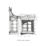
Since it’s opening day here at frame, I’ll leave you with something on the other end of the stylistic spectrum. Shallow bay windows normally found on turn of the last century skyscrapers are set next to a tall rural gable to make up the front facade. The bucolic villa type meets urban detail.
by nscoleman | Apr 15, 2016 | entire buildings

My client had just built a new greenhouse on his Malibu estate – it was awful. But the open framework of black steel and plexiglass infill on the roof and walls intrigued me. What about Mies in California, Neutra even?
by nscoleman | Apr 15, 2016 | words
I hope not. At least, not in the traditional sense. While I consider myself to be a writer, I do not intend to make this place about words. One of the most wonderful and accessible qualities of architecture is that it is a visual practice, and of the many ways of describing and communicating buildings, drawing remains the most poignant and essential. While historians write dissertations on the social, economic, or ecological impacts of architecture on our world, those who practice and learn our profession must draw architecture. The drawing is the fundamental communicative tool of the discipline – be it plan, section, elevation, reflected ceiling plan, or axonometric. As architects, we draw. And I believe we can draw argument – I believe that the architectural forms that I draw say something about what I believe architecture is, how it ought to be practiced, and rightly taught.
This website, frame, is my attempt to catalog my own arguments through drawing. I’ll try not to speak up too much outside of that, only adding the necessary introductions here and there (or references, for your own perusal). With that, enjoy.
-Nicholas
 This past February, my wife and I took a weekend trip to San Francisco, where we stumbled across the city’s cathedral – St Mary of the Assumption, by Pierluigi Nervi and Pietro Belluschi. The church is a square, with large piers in the corners supporting a gargantuan lantern, which also doubles as the church’s campanile. The large piers dominate the four corners which have been rendered in finely detailed glass storefronts, effectively making the church more of a standard Greek cross rather than the centrally-focused square it purports to be. I’ll be featuring my own riffs on this project over the coming days, but for now, I’ll let you appreciate the brutal simplicity of the form that started it all.


Recent Comments